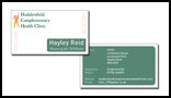
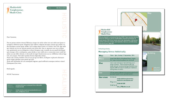
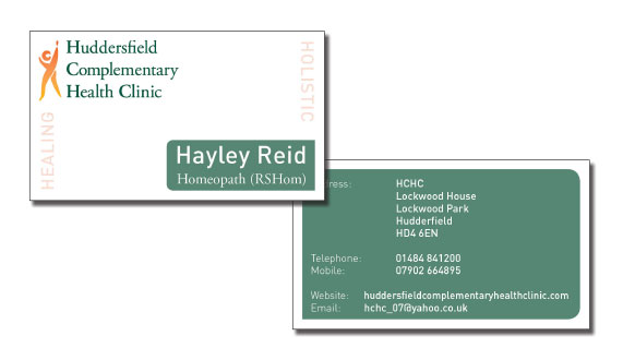
This newly created clinic required a logo and overall design concept. Various practitioners needed to communicate their friendly and alternative health services as a collective.
Solution:
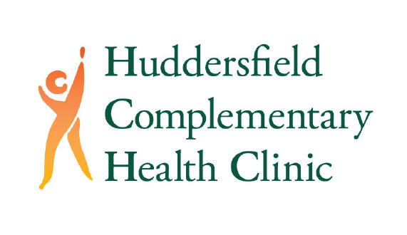
A clear colourful logo was designed with a simple human form reaching high. This was to signify positive health for the whole body. The figure has a C and H within it to signify the clinics name. A classic serif font was used to keep it traditional and trust worthy.
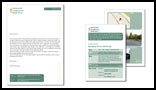
The clinic has many events, so an easy to amend template that they could edit in Microsoft Word was produced for multiple cost effective use.